The cover for Kendra Kandlestar and the Search for Arazeen

I’ve been posting some of the different options for the cover of the fifth and final Kendra Kandlestar book: The Search for Arazeen. Everyone, it seems, has had an opinion along the way. After a lot of input, we ended up down to two choices for illustrations: one with Kendra standing on the tower and one of Kendra standing in a swirl of smoke.

We also ended up with many color variations.

All sorts of factors played in our final decision. But, at last, here it is . . .

kendra_kandlestar_and_the_search_for_arazeen

And here it is with the back cover and spine.

Search for Arazeen - Cover - layout.indd

This is inevitably the part where people say they liked some of the other versions or options better . . . but I feel good about this one. Why? Mostly because I know how the story goes, how it ends, and what it’s all about. And this cover illustration and especially the colors match well with the journey that Kendra undertakes in this final book.

Stay tuned for a final, official release date. Along the way, I’ll post some sneak peeks of the text.


Working on the cover for Kendra Kandlestar (Part 3)

In recent blog posts, I’ve been showing some of the illustration work for the cover of my upcoming book, Kendra Kandlestar and the Search for Arazeen.

In this entry, I’m showing those illustrations in our cover design, with some of the different color options.

Search for Arazeen - Cover - b&w.indd Search for Arazeen - Cover - b&w.indd Search for Arazeen - Cover - gold03.indd Search for Arazeen - Cover - gold & black.indd Search for Arazeen - Cover - gold02.indd

The colors gold and black became the main options since they are different from the other colors chosen for the first four books in the series. Also, both gold and black are very thematically important to Kendra’s journey in this fifth and final book.

Next time, I’ll show the final version of the cover, including the back cover.

Working on the cover for Kendra Kandlestar 5 (part 2)

My last blog post showed some of my early cover designs for the fifth and final Kendra Kandlestar book, The Search for Arazeen. Those initial concepts just didn’t work, so I decided to work on some more simple compositions, ones that focused solely on Kendra.

I produced three different designs. The first one showed Kendra amidst the flames of battle. Here’s my initial sketch:

searchforarazeen_coversketch_fire

I also did a colorized version . . .

searchforarazeen_illustration_fire


The one below was a more peaceful concept, showing Kendra before the battle that happens in the book. I had actually produced this drawing for one of the interior illustrations.

kendra_tower_sketch

Here’s the inked black and white version of the above.

Kendra at Clovinstand

My editor really loved this illustration, so I decided it might serve as an option for the cover. So I flipped and colorized it:

searchforarazeen_illustration_tower


The final concept was also based on an interior illustration that I had already produced for the book interior.  These were the original rough sketches . . .

kendra_mist_sketch

Below, is an inked version. I kept coming back to this illustration a lot, so decided I could produce a version of it for the cover


searchforarazeen_illustration_shipdeck

Below, is a colorized version of the illustration. As you can see, I also removed any discernible background and added some mood with the swirls of clouds.

searchforarazeen_cover_smoke

I also made one alternate version, with some swords pointing at Kendra. I thought this would help add a bit more drama to the picture, plus visually accentuate her.

searchforarazeen_cover_smoke_swords

In my next post, I’ll show what each of these three illustrations looked like in the cover template, along with some of the color variations we played with.


Working on the cover for Kendra Kandlestar 5 (part 1)

There are a lot of things I have loved about working on the Kendra Kandlestar series. There’s the characters, the world, and all of the magical aspects of the adventures. And, when I think of those things, I think not only of the words I have created to bring those things to life, but the pictures, too.

One thing I have found the most challenging, however, is working on the covers. I help so many students work on the covers for their books, but I find it hard to see the forest for the trees when it comes to my own projects!

As is usual, the journey to get to a final cover for the last book in my series, has been a difficult one. I thought I would do a series of blog posts to show the progression of ideas.

I usually have an idea for a cover early on in a the process of a book, but in this case I left it for a long time. One reason is that just writing the book was consuming all of my energy. The other reason was that I had a dearth of ideas, and so I think I was just playing the procrastination game.

But the time eventually came where I couldn’t delay any longer. SO, working with the art director and publisher at Simply Read Books, I began generating ideas.

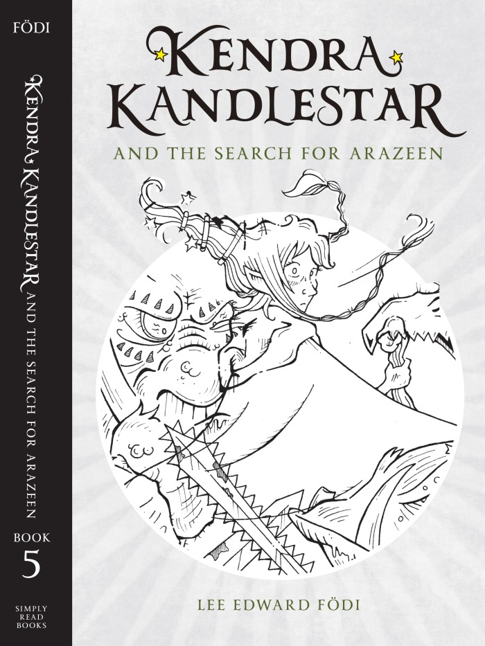
Because The Search for Arazeen is the final in the series, my initial instinct was to capture a moment from the dramatic climax of the book. Here is the sketch I thought would work for the cover:

searchforarazeen_coversketch_battle

It’s important to note that we already had a cover design established, the same one (a template, if you will) used for the rest of the series. So the illustration had to work within the boundaries of that layout. For the purposes of design and gauging the illustrations I was working on, we took the template and just neutralized it, sucking out all the colors and just using a black-and-gray version.

Here’s the that template with an inked version of the above illustration:

Search for Arazeen - Cover - b&w.indd

I found it just too busy. I wanted more focus on Kendra so thought maybe I should have her looking outward, confronting us. But that didn’t seem to work either:

Search for Arazeen - Cover - b&w.indd

So, now what?

It was back to the drawing board . . . literally! I’ll show some of my more illustrations in this process in my next blog post.


The Studio Revitalization project continues . . .

How important is your creative space?  I have my own in-house studio, but decided this year that I needed to revitalize it, particularly because I’ve started doing some more author visits via Skype.

Originally, I was supposed to accomplish this project during Spring Break . . . but then one thing led to another and now, here I am in September, still working on it. The good news, is that I finally received my custom-built shelves . . .

studioshelves

They’ll look great against my orange wall . . . now I just need to hang them . . .


The Holy Ketchup . . . and other covers by my students

Earlier in the summer, I posted some of the covers designed by my students who take my creative writing program (you can view those covers here and here).

Here’s another round of artwork. Most of these covers were introduced by the students, but in a couple of cases I worked with the young writer to pick and purchase some stock photography.

I have to say, one of my favorite covers is for The Holy Ketchup. (By the way, I famously despise ketchup, and it’s this hatred that served as inspiration for the entire book!)

untitled untitled untitled untitled untitled untitled untitled untitled untitled untitled untitled